Brand name
“Uni” is extracted from the word “United” – which has similar meaning to solidarity. This is a social value highly respected by Laotian people. Unitel is created as a telecom network to connect the Laotian and bring them a better life.
Logo

The symbol of logo is 2 interlocking U, expressed solidarity and consistency with brand positioning. This image also expresses image of a flying butterfly, containing the dynamics and enthusiasm of a new telecommunications network with the desire to provide telecommunications services to everywhere. Orange color is chosen because it is the color of fresh, dynamic and modern-the color represents a dynamic telecommunications network
Message
Unitel's message - "Brighter" implies bring a brighter life for the people of Laos, Unitel is the network provides telecommunications services to all parts of the country.
03.11.2017
03.11.2017
15.03.2015
15.03.2015
15.03.2015
15.03.2015

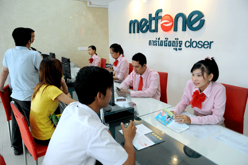
Company name: Viettel (Cambodia) Pte., Ltd
Address: 199 Mao Tse Tung Blvd (Street 245), Sangkat Toul SvayPrey 2, Khan Chamkarmon, Phnom Penh, Kingdom of Cambodia
Website: www.metfone.com.kh
Brand name: Metfone
Logo: 
Metfone is made from Khmer language. "Mette" means "friend". By adding English words commonly used in telecommunications "fone", we created a brand name that have both Cambodia value and global telecommunications value - Metfone.
Friendship and good life are 2 things Khmer cherish most. Therefore, Metfone wants to become a telecommunications networks to bring better future for Cambodian, like close friend.
Established: 2006
Service launching: February 2009
Employees: 2245 staffs
Services providing: Mobile, Internet, fixed broadband
The No.1 mobile operator accounting for 50% market share with 4.3 million subscribers, owning the biggest telecom network in terms of:
International Awards achieved:
I. OVERVIEW
1. General Information
- Country: Cambodia
- Capital: Phnom Penh
- Area: 181,035 km2, ranked 90th in the world.
- Geographical location:
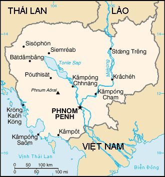
It borders Thailand to the north and west, Laos to the northeast, and Vietnam to the east and southeast. It has a 443-kilometer (275 mi) coastline along the Guft of Thailand
- Climate:
Cambodia's climate is tropical wet and dry. It has a temperature range from 21 to 35 °C (69.8 to 95.0 °F) and experiences tropical monsoons. Cambodia has two distinct seasons. The rainy season, which runs from May to October, can see temperatures drop to 22 °C (71.6 °F) and is generally accompanied with high humidity. The dry season lasts from November to April when temperatures can rise up to 40 °C (104 °F) around April.
- Terrain:
Cambodia's landscape is characterized by a low-lying central plain that is surrounded by uplands and low mountains and includes the Great Lake and the upper reaches of the Mekong River delta. Extending outward from this central region are transitional plains, thinly forested and rising to elevations of about 650 feet (200 meters) above sea level.
- Administrative unit:
Cambodia is divided into 25 provinces including the capital. Municipalities and districts are the second-level administrative divisions of Cambodia. The provinces are subdivided into 159 districts and 26 municipalities. The districts and municipalities in turn are further divided into communes (khum) and quarters (sangkat).
- Language:
Khmer, French, English.
Cambodia is a homogeneous country with more than 90% population speaks Khmer. French and English is widely used in Cambodia as a second language
- Currencies: Riel. Exchange rate: 1 USD = 4062 Riel
- Independence : 11/09/1953.
2. Economy
- GPD growth rate:
+ GPD growth rate in 2013: 7.3%
+ GDP 2013: 17:25 billion
+ GDP per capita in 2013: $ 1.108
Cambodia's economy is considered to be one of the most open economies in Asia with a large participation of the private sector and abroad. Cambodia is considered as potential country with natural resources, young workforce, cheap labor.
Cambodia is basically an agricultural country, the main economic sectors are agriculture, textiles and tourism.
- The structure of the economy:
+ Agriculture: 36%
+ Industry: 24.3%
+ Services: 39.7% (2012 est.)
Some characteristics of the economic structure:
Agriculture accounts 35% of GDP. Harvested Rice is estimated at over 6 million tonnes per year, exports about 1 million tonnes.. Cambodian Agricultural products are mainly rice, maize, groundnuts, rubber, tobacco, ...
- Industry: including textiles, construction, fishing, wood and wood products, rubber, cement, ore out, ... in which textiles, construction is the mainstay of the economy. The garment industry represents the largest portion of Cambodia's manufacturing sector, accounting for 80% of the country's exports. Cambodia also has some deposits of precious stones, ruby, gold, bauxite, .... In 2010, the growth rate of the industry reached 5.7%.
The tourism industry is the country's second-greatest source of hard currency after the textile in 1993 there were 118,183 international tourists, and in 2009 there were 2,161,577 international tourists. Most of the tourists were Japanese, Chinese, Filipinos, Americans, South Koreans and French, said the report, adding that the industry earned some 1.4 billion U.S. dollars in 2007, accounting for almost ten percent of the kingdom's gross national products..
- Fair Trade: The Fair Trade movement has led to a large number of handicrafts being exported for use around the world. Fair trade is used as a way to garner employment for the disabled and under privileged and is fuelled by many organisations who give aid to Cambodia.
- Export
+ Exports: $ 5.8 billion (2012 est.).
+ Export commodities: clothing, wood, rubber, rice, fish, tobacco, footwear.
(US 32.7%, UK 8.4%, Germany 7.7%, Canada 7.7%, Singapore 6.6%, Vietnam 5.8%, Japan 4.7% (year 2012))
- Import
+ Imports: $ 7.8 billion (2012 est.).
+ Imported commodities: petroleum products, cigarettes, gold, construction materials, machinery, motor vehicles, pharmaceuticals.
(Thailand 27.2%, Vietnam 20%, China 19.5%, Singapore 7.1%, Hong Kong 5.9%, South Korea 4.3%)
II. SOCIETY
1. Population:
Population 7/2013: 15,205,539 people.
The population growth rate: 1.67% (2013 est.).
Population density: 74 people / km2.
The proportion of poor people: 56.5% (living below $ 2 / day).
The rate of literacy (age 15 and up): 77.6% (males: 85.1%, female 70.9%) (data 2008).
Age:
+ From 0-14 years: 31.7% (male 2,428,507 / female 2,397,327)
+ From 15-24 years: 21.2% (male 1,597,990 / female 1,627,161)
+ From 25-54 years: 38.2% (male 2,828,752 / female 2,985,226)
+ From 55-64 years: 4.9% (male 287.073 / 464.991 female)
+ From 65 years and over: 3.9% (male 221.356 / 367.156 female) (2013 est.)
+ Population Cambodian children, aged 0-24 years old accounted for 53% of the population.
+ Population in the capital: 1.55 million people (2011).
+ Labour force by occupation:
Agriculture: 55.8%
Industry: 16.9%
Services: 27.3%.
2. Ethic group
The largest ethnic group in Cambodia are the Khmers, who comprise around 90% of the total population in Cambodia, and are indigenous to the lowland Mekong subregion in which they inhabit. The Vietnamese are the largest (or second largest) ethnic minority in Cambodia, with an estimated 400,000 - 700,000 living in provinces concentrated in the southeast of the country adjacent to the Mekong delta. Chinese Cambodians are approximately 1% of the population. Most Chinese are descended from 19th–20th century
3. Religion
Buddhism is the official religion of Cambodia, practiced by more than 95 percent of the population with an estimated 4,392 monastery temples throughout the country. Cambodian Buddhism is deeply pervaded by Hinduism, Tantrism, and native animism. Key concepts in Cambodian Buddhism include bonn (Pali punna, merit), reincarnation, and kamm (Pali kamma, karma), which means the moral result accruing from action in Pali but a concept closer to "misfortune" in Khmer.
Company Name: Viettel Cameroun SARL
Address: 87 P.B Yaounde, Cameroon
Website: www.nexttel.com
Brand: Nexttel
Logo: ![]()
Nexttel always support and create conditions for people to express creation and to contribute to the development of Cameroon.
Brand name Nexttel composed of "Next" and "Telecommunication" - implying to a telecommunications company which always developing to bring people the best services.
Established: 2012
Services lauching: 9/2014
Employees:
Services providing: Mobile, Internet, fixed broadband
Nexttel is the first network in Cameroon provide 3G services. With network infrastructure includin fiber optic, Nexttel aims to provide the latest industry experienced the most advanced technology to the people of Cameroon.

I. OVERVIEW
1. General Information
- Country: Republic of Cameroon
- Capital: Yaoundé
- Area: 475,440 km2 (1.4 times larger than Vietnam), ranked 54th in the world.
- Location: The country is located in Central and West Africa on the Bight of Bonny, part of the Gulf of Guinea and the Atlantic Ocean. The country's neighbours are Nigeria to the west; Chad to the northeast; the Central African Republic to the east; and Equatorial Guinea, Gabon and the Republic of the Congo to the south

- Climate: Cameroon is divided into 2 different climatic zones:
+ North Region: Dry, with two seasons: rainy and dry.
* The rainy season from April to September, the average rainfall is about 1000-1750 mm / 1 year.
* The rest of the year is the dry season where temperatures can reach 40 ° C. The average temperature is about 28 ° C.
+ South Region: hot and humid, divided into two rainy seasons and two dry seasons.
* Rainy season from March to June, heavy rains from August to November.
* Dry season from June to August, hard from November to March.
- Terrain:
Cameroon has many hills, average altitude is about 1,000 meters above the sea.
- Language: Both English and French are official languages, although French is by far the most understood language (80+%)
- National: 05/20/1972.
2. Economy
- GDP growth rate:
+ GDP growth rate in 2014: 5%
+ GDP per capita in 2013: $ 1.315.
- GDP composition by sector:
+ Agriculture: 20.7%
+ Industry: 27.7%
+ Services: 51.6% (2012 est.)
- Exports:
+ Exports: $ 6 billion (2012 est.).
+ Export commodities: crude oil and petroleum products, timber, cocoa, aluminum, coffee and cotton.
( China 14.8%, Netherlands 9.5%, Spain 8.8%, India 8.4%, Portugal 7.9%, Italy 5.9%, US 5 and 3%.)
- Import
+ Imports: $ 6.5 billion (2012 est.).
+ Imported commodities: machinery, electrical equipment, transport equipment, fuel and food.
( China 18.9%, France 15%, Nigeria 12.1%, Belgium 5.2%, 4.4% American Indian 4.2%.)
II. SOCIETY
1. Population:
- Population: 20,549,221 people (2013 est.)
- The population growth rate: 2.04% (2013 est.).
- The proportion of the poor: 48% (living below $ 2 / day).
- The rate of literacy (age 15 and up): 71.3% of the population.
- Age ratio:
0-14: 40% (male 4,151,140 / female 4,076,797)
15-24 years: 20.3% (male 2,107,067 / female 2,066,718)
25-54: 31.9% (male 3,317,740 / female 3,240,609)
55-64: 4.3% (male 419.751 / 468.077 female)
65 and over: 3.4% (male 319.597 / 381.725 female) (2013 est.)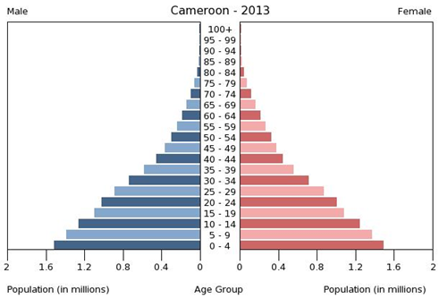
Cameroon's population is quite young, between the ages of 0-24 years old accounted for 60.3% of the population.
- Urban population: 52.1% (2011).
- Labor force by occupations:
+ Agriculture: 70%
+ Industry: 13%
+ Services: 17%
2. Ethnic group:
- Ethnic groups of Cameroon: the Cameroon Highlanders (31%), Equatorial Bantu (19%), the Kirdi (11%), the Fulani (10%), the Northwest Bantu (8%), the East Nigeria (7%), African people of other ethnic groups (13%), not Africans (under 1%).
3. Religion: 40% of people in Cameroon follow indigenous beliefs, 40% Christian and 20% Muslim.
4. Education:
In 2010, the literacy rate of Cameroon was estimated to be 71.3% (male 78.3% and female 64.8%). Most children have access to state-run schools that are cheaper than private and religious facilities. The educational system is a mixture of British and French precedents with most instruction in English or French.
Cameroon has one of the highest school attendance rates in Africa. Girls attend school less regularly than boys do because of cultural attitudes, domestic duties, early marriage and pregnancy, and sexual harassment. Although attendance rates are higher in the south, a disproportionate number of teachers are stationed there, leaving northern schools chronically understaffed
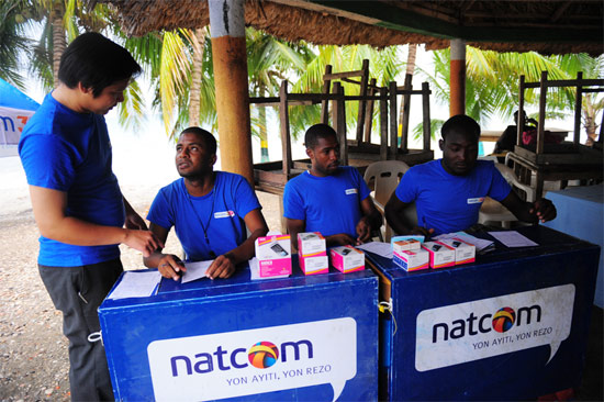
Company’s name: Natcom, SA
Addres: Angle Ave. Martin Luther King et rue Fernand, Pont Morin, Port-au-Prince, Haiti
Website: www.natcom.com.ht
Brand: Natcom
Logo: 
“Natcom” composes of two words “National” and “Communication”, meaning the National Telecommunications Company. It implies that Natcom is a network of the Haitian people and is committed to serve the people of Haitian.
As a national operator, Natcom provides the best products and services to bring people closer together as well as bring solidarity and unity to Haitians.
Year of establishment: 1/2010
Launch of services: 9/2010
Employees: 1046 staffs
Service launching: Mobile, Internet, fixed broadband
NATCOM is the biggest telecom network in Haiti:
I. OVERVIEW
1. General information
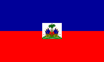
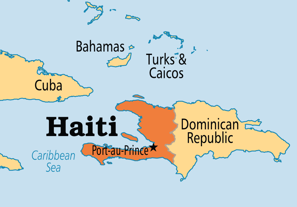
- Country name: Republic of Haiti
- Total area: 27,750km2.
- Location: Caribbean, borders the Dominican Republic in the East and the ocean in the North, West and South.
- Climate: tropical; semiarid where mountains in east cut off trade winds.
- Terrain: mostly rough and mountainous.
- Capital: Port-au-Prince.
- Administrative divisions: 10 departments. The departments are divided into 41 districts and then 133 communes.
- Language: French, Creole.
- National day: 31/12/1804.
2. Economy
- GDP growth rate:
+ GDP growth rate (2012): 2.8% (ranked 115th)
+ GDP per capita (2012): 771 USD
- Haiti is a free market economy that enjoys the advantages of low labor costs and tariff-free to the US for many of its export products. However, Haiti remains the poorest and least developped country in the world.
- During the past 5 years, Haiti’s economy experienced a slow growth rate. Average growth rate stayed at 2.3% (2005 – 2009). Haiti's economy had a setback when the country was struck by a 7.0 magnitude earthquake, claiming 230 thousand deads and great impact on the economy.
- GDP composition by sector:
Agriculture: 24.7%
Industry: 19.4%
Services: 55.9% (2012 est.)
- Economy characteristics:
+ Agriculture products: coffee, mangoes, cocoa, sugarcane, rice, corn, sorghum; wood, vetiver.
+ Industrial products: textiles, sugar refining, flour milling, cement, light assembly based on imported parts.
+ Services: trading, hotels, restaurants.
- Exports:
+ Export value: USD 785 million (2012 est.).
+ Export products: apparel, manufactures, oils, cocoa, mangoes, coffee.
+ Export partners: mainly US, accounting for 81.5%.
- Imports:
+ Import: USD 2.64 billion (2012 est.).
+ Import products: food, manufactured goods, machinery and transport equipment, fuels, raw materials.
+ Import partners: Dominican Republic: 35.9%, US: 24.7%, Netherlands: 9.8%, China: 6.6% (2012).
II. SOCIETY
1. Population
- Total population (7/2013): 9,893,934.
- Growth rate (2013 est.): 0.99%.
- Density: 367.34 person/1 km2 (2011).
- Poverty rate: 80% (living with less than 2 USD/day).
- Literacy rate (aging 15+): 52.9%.
- Age structure:
0-14 years: 34% (male 1,701,559/female 1,693,236)
15-24 years: 21.6% (male 1,078,994/female 1,081,005)
25-54 years: 35.3% (male 1,755,722/female 1,770,386)
55-64 years: 4.1% (male 241,174/female 263,369)
65 years and over: 4.1% (male 183,627/female 227,659) (2014 est.)
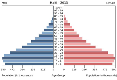
- Haiti has young age structure with total number of people aging 0-24 rate of 56.1%
- Urban population rate: 52% (2012).
- Workforce by economic sector:
Agriculture: 24.7%
Industry: 19.4%
Services: 55.9%.
2. Education:
Haiti has a low literacy rate of 52.9% (male: 54.8% and female: 51.2%). In accordance with the laws, education for children from 7-13years old are free and obligatory. However, participation rate is low due to constraints in school locations and language barrier (classes are mostly in French), and quality of teachers. More than 80% of university graduates have migrated to the US.
3. Religions:
Roman Catholic 80%, Protestant 16% (Baptist 10%, Pentecostal 4%, Adventist 1%, other 1%), none 1%, other 3%.
III. HAITIAN LIVING ABROAD
- According to a statistic from The Haitian Diaspora Federation (www.myhdf.org), currently there is 1/3 of Haiti population in the world living outside Haiti.
- Most of them (2.5 million people) live in the US: 700,000 in New York; 500,000 in Florida; 150,000 each in Massachusetts, New Jersey and Illinois; 80,000 in Georgia and the rest of the country.
- The Haitian also live in other countries, including Canada (about 100,000), Europe and Africa (about 30,000 each continent) and Caribbean islands, mostly in Dominican Republic (about 1 million).
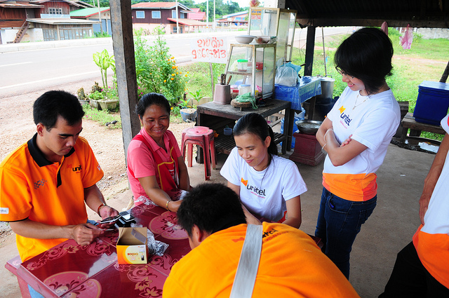
Company name: Star Telecom. Co, Ltd.
Address: Nongbone road, Phonxay village, Saysettha district, Vientiane Capital, Lao P.D.R
Website: www.unitel.com.la
Brand name: Unitel
Logo:
“Uni” is extracted from the word “United” – which has similar meaning to solidarity. This is a social value highly respected by Laotian people. Unitel is created as a telecom network to connect the Laotian and bring them a better life.
Established: 2007
Service launching: November 2009
Employees: 1.540 staffs.
Services providing: Mobile, Internet, fixed broadband
Star Telecom is a joint venture between Viettel Global and Lao Asia Telecom to provide telecom services under brand name Unitel. With USD 201 million of revenue in 2014, Unitel is the second largest company in Laos.
Unitel is the leading mobile operator in Laos accounting for 47% market share with 1.8 million customers, owning the biggest telecom network in terms of:
International Awards achieved: Best Operator in Emerging Market by World Communications Awards (2012).
I. OVERVIEW
1. General information
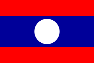
- Name of country: Lao People’s Democratic Republic
- Area: 236,800km2, 84th position in the world.
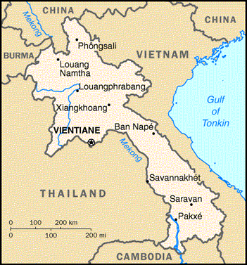
- Geography: Laos lies in Southeast Asia, in the center of the Indochina peninsular. Laos is a landlocked country which borders China in the North (505 km); Cambodia in the South (535 km); Vietnam in the East (2,069 km), Myanmar in the North West (236 km); and Thailand in the West (1,835 km).
- Climate: Tropical monsoon with 2 seasons:
+ Rainy season: from May to November, temperature is around 30o C, rain frequently falls, some years caused floods in the Mekong.
+ Dry season: from November 11 to April, temperature is around 15o C, sometimes 0o C in the mountains.
- Terrain: 90% of the land is mountainous, some deltas and highlands.
- Capital city: Vientiane.
- Administrative divisions: 16 provinces, 143 districts (muang) and 8,649 villages (ban).
- Languages: Laos, French, English.
- Currency: Kip. Exchange rate (6/2014): USD 1.00 = 8,057.00 Kip
- National day: 2/12/1975.
2. Economy
- Economic growth:
+ GDP growth rate (2013 est.): 8,3%
+ GDP per capita (2013 est): USD 3,100.
+ GDP growth rate graph:
Laos Government started to implement economic reform policies since 1986. Thanks to these innovative measures, the country could achieve average growth rate of 6% in the period from 1988 to 2008. From 2008, Laos always maintains a pretty high GDP growth rate, average of 7,6%. Despite enjoying a fair economic growth, the country’s infrastructure is still poor, especially in rural areas. Road systems are in basic condition, electricity has not reached remote areas. The economy depends on agriculture which accounts more than 30% of GDP, labour force in agriculture represents 70% of the total work force.
In the second half of 2008 and the beginning of 2009, Laos received approximately USD 560 million grant from the United States. Poverty rate decreased from 46% in 1992 to 26% in 2009. Thanks to foreign investment in thermal power sector, mining, construction the economy made significant steps forwards.
Laos finalized all official negotiation rounds to enter the WTO in February 2013.
- GDP composition: Agriculture: 24.8%
Industry: 32%
Services: 37.5% (2013 est.)
- Some facts of the economy’s composition:
+ In recent years, the services sector maintains a growth rate of about 10%, industry 7-10%, agriculture 2-4%.
+ Major industrial activities in Laos include mining, hydro power, forestry, textile, cement, tourism.
+ Main agricultural products include: sweet potato, potato, vegetable, cereal, coffee, sugar cane, tobacco, fabric, tea, rice, peanut, water buffalo, pig, goat and other poultries.
+ The majority of goods are imported from Thailand. In recent years, Chinese goods penetrate the market via small tracks, especially telephone, tools, children toys…
- Exports:
+ Export value: USD 2,3 billion USD (2013 est.).
+ Exported commodities: wood products, coffee, electricity, tin, copper, gold, cassava.
+ Export partners: Thailand 34%, China 21.5%, Vietnam 12.2% (2012).
- Imports:
+ Import value: USD 3.2 billion USD (2013 est.).
+ Imported commodities: machinery and equipment, vehicles, fuel, consumer goods.
+ Import partners: Thailand 62.1%, China 16.2%, Vietnam 7.3% (2012)
II. SOCIETY
1. Administrative division
The administrative division of Laos composes of 4 levels: 1 central level and 3 local levels. The highest grade of local level is province, the second includes district and town and the last is village.
The capital city of Laos is Vientiane and the second largest city is Luang Prabang. Savannakhet and Pakse are also large cities in Laos.
Vientiane is meant a “moon city”, which became the capital city of Laos since 1563. Located on the left bank of the Mekong river, to the North West of the country, Vientiane is 3,920 km2 large and has the population of around 1 million people. As the largest cultural, commercial, administrative and economic centre of the country, Vientiane is also a famous tourist attraction which is an economic focal point of the city. Many beautiful landscapes, huge and ancient pagodas which are centres of festivals characterizing Lao cultures.
Luang Prabang has the meaning of Huge golden Buddha, which used to be the royal city of the kingdom of Lan Xang (Million Elephants) from the 14th century until 1946. Today, Luang Prabang is well known for its beauty tourist attraction and is recognized by the UNESCO as the world’s heritage.
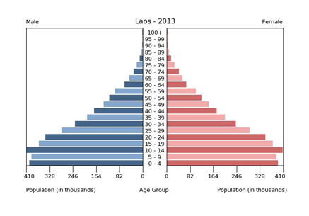
2. Population
- Population by 7/2013: 6,695,166 people.
- Population growth rate 1.63% (2013 est.).
- Population below poverty line: 56.5% (spend less than 2 USD/day).
- Literacy (from 15 years old): 72.7% population.
Ages:
- From 0-14 years: 35.5% (male 1,198,288/female 1,178,180)
- From 15-24 years: 21.3% (male 706,679/female 716,368)
- From 25-54 years: 34.6% (male 1,143,265/female 1,174,102)
- From 55-64 years: 4.9% (male 160,650/female 166,605)
- From 65 and over: 3.7% (male 113,301/female 137,728)
- Rate of urbanization: 34,3% (2011)
- Population of Vientiane: 997.767 people (8/2013).
3. Characteristics:
More than 75% Lao population live in rural areas and engage in farming, even though the urbanization process is occurring rapidly. There are 4 main ethnic groups: Lao Loum who live in the deltas; Lao Tai, who live in valleys of mountainous areas; Lao Theung, live on mountain’s slopes and valleys; Lao Soung, who are mountainous dwellers living on places over 900m height. Apart of those, there are more than 60 other ethnic minorities in Laos.
4. Religions
Buddhist 67%, Christian 1.5%, other and unspecified 31.5% (2005 census).
Buddhism is the most popular belief in Laos, which is followed by 67% of the Lao population and most of the Lao people. The number of Buddhist followers can be higher, as Buddhist has strong impact on many other ethnic groups, who always consider themselves animists. The majority of Lao people are Theravada Buddhist but inherited historically from Mahayana Buddhism. This is also the main belief of the Vietnamese and Chinese ethnic people who live amongst the Laotians.
In the Lao community, pagoda and temple are centers of the community’s activities, where the villagers gather and discuss their concerns or seek for advice and instruction from the monks. Most of the men will move to stay in pagodas for a certain period of time to grasp more knowledge and dedicate merit.
5. Literacy
73% of the population over 15 years old can read and write (83% male, 63% female)
Language: Popular languages spoken in Laos is Lao language, Thai language, English and some ethnic languages.
Company name: Movitel, SA.
Address: No 2586 Av.Ahmed Sekou Toure, Maputo, Mozambique
Website: www.movitel.com.mz
Brand name: Movitel
Logo: 
Going from the simple Mozambicans’ dreams of a brighter future, Movitel is committed to becoming a Mozambican leading telecommunication company, and offering better tomorrow for every Mozambican. The brand name Movitel is the combination of the words "Movement" and "Telecom" - alluding to a telecommunication company that always moves forward. Only by always creating and changing to adapt, can Movitel move forward with all Mozambicans, reaching out to a bright future.
Established: 2011
Service launching: May 2012
Employees: 2510 staffs including 205 Vietnamese, 2305 Mozambican
Services providing: Mobile, Internet, fixed broadband
Movitel is the largest mobile operator in Mozambique with 4 million customers, accounting for 38% market share. It owns the biggest telecom network with 3,000 2G/3G base stations, 27,000 km of fiber optical cable covering 80% of Mozambican population. Movitel contributes 70% of the country’s fiber optical cable, making Mozambique among the top three nations in terms of fiber optical cable infrastructure in Sub-Saharan Africa.
This infrastructure enables Mozambique’s telecommunication industry to implement the E-Government and ICT applications in the education and healthcare sectors for socio-economic development. Nearly 600,000 people in at least 5 rural districts in Mozambique have been covered and served telecom services for the first time in life. Movitel has created nearly 20,000 jobs in rural areas.
Movitel has improved its successful business strategy as a caring and innovative network for every Mozambican through its business results and the recognition of many international awards. By the end of 2012, only 6 months from launching, Movitel made total revenue of USD 61.6 million. The next 2 years saw significant rise in revenue with USD 154.4 million in 2013 and USD 180 million in 2014.
International Awards
Awards:

I. OVERVIEW
1. General information
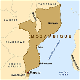
- Country name: Republic of Mozambique
- Area: 799.380 km2 (2.5 times larger than Vietnam).
- Location: Southeastern Africa, bordering Tanzania in the North, Swaziland and South Africa in the South, Malawi, Zambia and Zimbabwe in the West, and the Indian Ocean in the East.
- Climate:
Mozambique lies in tropical monsoon climate region with 2 seasons: rainy season and dry season:
+ Dry season: April to September with average temperature of 21 – 31၀C.
+ Rainy season: October to March with average temperature of 13 – 24၀C.
- Terrain: mostly coastal lowlands, highlands in center, plateau in the Northwest, mountains in the West.
- Language: Portuguese, Emakhuwa.
- National day: 25/6/1975
- National animal: Elephant (Africa).
2. Administrative Divisions
Mozambique is divided into 10 provinces (provincias, singular - provincia) and 1 capital city (cidade capital); The 10 provinces are divided into 138 districts (distritos). The districts are then divided into 405 administrative points, then 2,171 localities.
Characteristics of some cities/provinces in Mozambique:
– The capital city of Maputo: is the largest city in Mozambique which is located to the Southeast of the country with a well-equipped sea port and international airport.
– Nampula is the third largest city in Mozambique after Maputo and Beira. Located in the Northeast of Mozambique, Nampula is the trade center in the North, which is 1,600 km from Maputo.
3. Economy
- Growth rate:
+ GDP growth in 2012: 7.4% (ranked 33th worldwide)
+ GDP per capita 2012: USD 579.00
- Mozambique is an agricultural country. Subsistence agriculture employs about 81% of the country's work force and contributes around 23.1% to the country’s GDP. Main agriculture products: cotton, cashew nuts, sugarcane, tea, cassava (tapioca), corn, coconuts, sisal, citrus and tropical fruits, potatoes, sunflowers; beef, poultry. Cashew nut export volume used to reach 29,000 metric ton per year. Agriculture production does not meet domestic demands, thus, Mozambique has to import 20,000-30,000 metric ton of rice every year.
- Industry only attracts 6% of the total workforce, contributing 30.2% to the GDP. The Cahora Bassa Dam helps increase its electricity exports and fulfill the needs of its burgeoning domestic industries. Main industrial products: aluminum, petroleum products, chemicals (fertilizer, soap, paints), textiles, cement, glass, asbestos, tobacco, food, beverages.
- Service sector in Mozambique is quite developed, attracting 13% of total workforce, and contributing 46.7% to GDP (2007). Port and terminal services also become Mozambique’s source of foreign currency.
- Economic structure: Agriculture: 29.5%
Industry: 23.9%
Services: 46.5% (2012 est.)
- Exports:
+ Export: USD 3.5 billion (2012 est.).
+ Export products: aluminum, prawns, cashews, cotton, sugar, citrus, timber; bulk electricity
+ Export markets: South Africa: 30.9%, Belgium: 12.8%, China: 9%, Ý 7.8%, Spain: 6.2%, India: 5.6% (2012).
- Imports:
+ Import value: USD 6.167 billion (2012 est.).
+ Import products: machinery and equipment, vehicles, fuel, chemicals, metal products, foodstuffs, textiles.
+ Import markets: South Africa: 30.7%, China: 12.2%, India: 11.4%, United States: 5.1%, Portugal: 4.8%, Australia 4.4% (2012).
II. SOCIETY
1.Population
- Total population by July 2013 (est.): 24,692,144.
- Growth rate (2013 est.): 2.44%.
- Density: 28.7 /1 km2.
- Rate of people living below poverty line: 81.6% (below 2USD/day).
- Literacy rate (aging 15+): 56.1%.
- Age structure:
0-14 years: 45.7% (male 5,405,274/female 5,350,732)
15-24 years: 20.7% (male 2,356,035/female 2,523,416)
25-54 years: 27% (male 2,977,477/female 3,382,830)
55-64 years: 3.5% (male 388,640/female 435,519)
65 years and over: 3% (male 320,066/nữ 375,945)
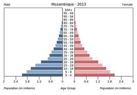
- Mozambique population is young, age from 0-24 accounts for 66.4%.
- Urban population ratio: 38.4% (2012).
- Population in cities: Maputo (6.1%), Baucau (11%), Ermera (2.8%).
- Population allocation:
+ Agriculture: 81%
+ Industry: 6%
+ Services: 13%.
2. Class Discrimination
There exists clear class discrimination in Mozambique. Normally, the rich live in cities while the poor live in villages. Those of higher class separate themselves from the poorer class due to the differences in education and healthcare conditions.
Such discrimination is also represented in geographical areas. Most of the population, the rich and government bodies are located in the South, near Maputo. This place is more developed, with better infrastructure. This is one of the fact that leads to tension between these 2 regions.
3. Ethnic groups
Mozambique has 64 ethnic groups with 9 larger groups. Makhuwa – Lomwe is the largest group which accounts for 50% of the population who live in the South. 3% of the population are from Europe, India, China, Pakistan and Mestizo (mixed of African and European). They live in provinces along the coast and do non-agriculture job such as teacher, lawyer, worker,... Today there is around 1.1 million expatriates living in Malawi and Zimbabwe.
4. Religions
Roman Catholic 23.8%, Muslim 17.8%. The rest are other religions and infidel.
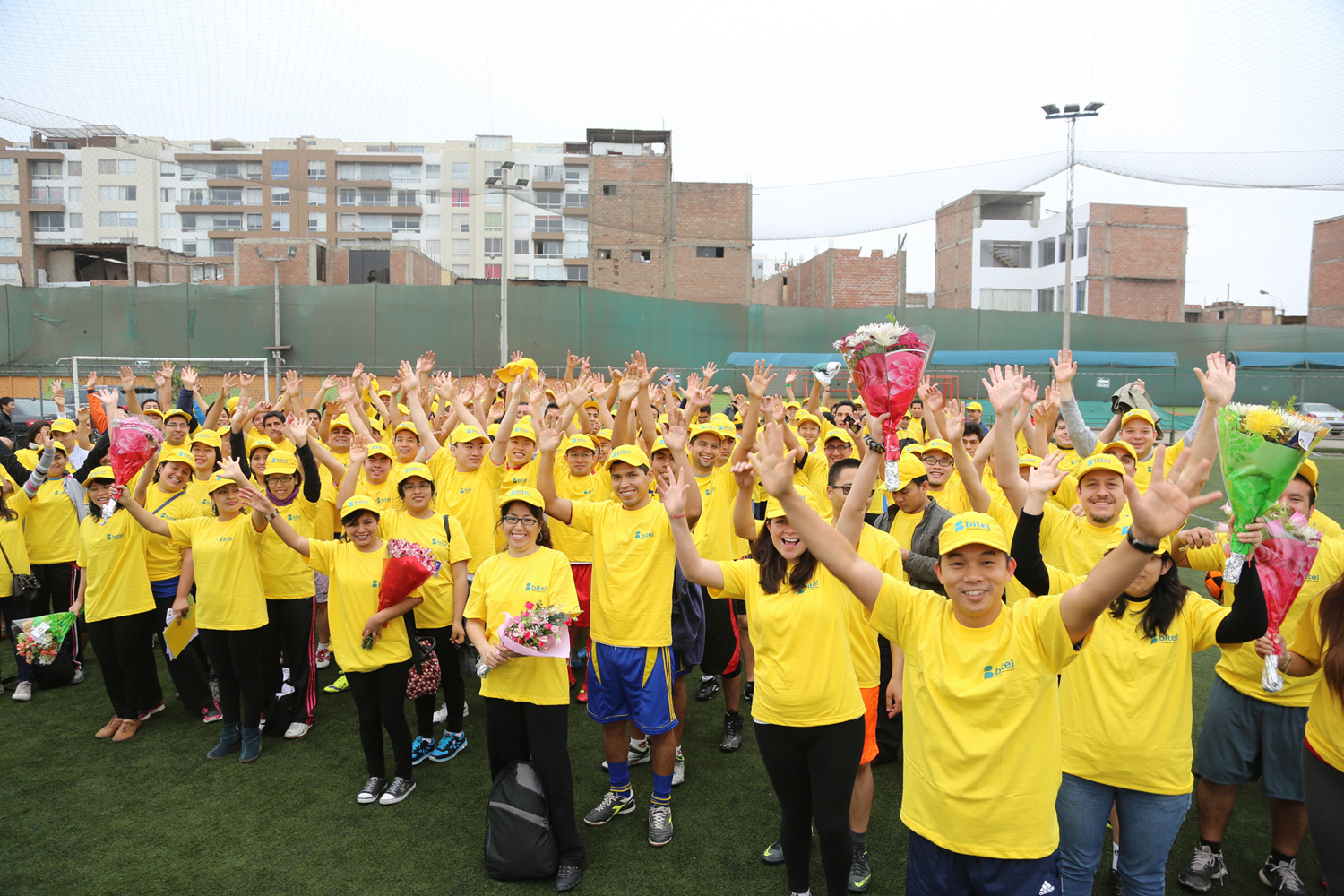
VIETTEL IN PERU
Company name: Viettel Peru S.A
Address: #878 Calle 21 (Ricardo Angulo), San Isidro, Lima, Peru.
Website: www.bitel.com.pe
Brand name: Bitel
Logo: 
The Logo comprises the name Bitel, the icon and the slogan. The letter B originates from the idea of the flying Peruvian flag. The two conversing bubbles forming the letter B symbolize communication, telecommunications. Bi in Spanish is understood as “pair, couple”, indicating the interaction between the operator and its customers as well as their concern, respect and dialogue for one another. The dominating color of Bitel is yellow, a symbol of the Inca culture which worships the Sun God and gold. The yellow color symbolizes optimism, hope, luck, and happiness.
Established: 2011
Service launching: October 2014
Employees: 1682 staffs.
Services providing: Mobile, Internet
Bitel is the first mobile operator using 3G only network in Peru, with mobile internet coverage to 80% of the nation. Peru is the first overseas market of Viettel that has a considerably higher GDP than Vietnam. Hence, launching Bitel marked a new developmenent milestone in the globalization process of Viettel. Few months after its official service launching on Oct 2014, Bitel has contributed to generate a data booming trend in Peruvian telecom market.
I. OVERVIEW
1. General Information
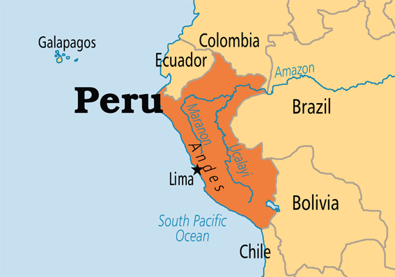
- Country: Republic of Peru
- Area: 1,285,216 km2, ranked 20th in the world, 3.5 times bigger than Vietnam.
- Capital: Lima
- Location: It is bordered in the north by Ecuador and Colombia, in the east by Brazil, in the southeast by Bolivia, in the south by Chile, and in the west by the Pacific Ocean.
- Climate:
Peru has a tropical climate. The average temperature is 20 ° C. Average rainfall: 700-3000 mm. Rainy season from December to February , dry season from May to November.
- Topography: Peru can be divided into three main topographic regions from west to east: the Pacific coastal region, Andes region and the Amazon basin
- Language: Peru has two official languages: Spanish (84.1%), Quechua dialect (13%) and the rest in other languages.
- Independence: 28/07/1821
2. Economy
GDP growth rate:
+ GDP growth rate in 2013: 5.8%
+ GDP per capita in 2013: $ 6.660
Peru is a free trade country. The economy of Peru is classified as upper middle income by the World Bank and is the 39th largest in the world. Peru is, as of 2011, one of the world's fastest-growing economies owing to the economic boom experienced during the 2000s; Trade is expected to increase further after the implementation of a free trade agreement . Peru's main exports are copper, gold, zinc, textiles, and fish meal; its major trade partners are the United States, China, Brazil, and Chile. Tourism receives more than 1 million international passengers and more than $ 1.2 billion per year.
Recent economic growth has been fueled by macroeconomic stability, improved terms of trade, and rising investment and consumption.
- GDP composition by sector:
Agriculture: 6.4%
Industry: 36.3%
Services: 57.3% (2012 est.)
- Export:
+ Export: 45.6 billion (2012 est.).
+Export commodities: copper, gold, lead, zinc, tin, iron, molybdenum, silver, crude oil and petroleum products, natural gas, coffee, asparagus and other vegetables, fruits, textiles fishmeal, fish, chemicals, metal products and machinery, alloy
Export Markets: China 19.7%, US 15.5%, Canada 9.4%, Japan 6.5%, Spain 5.2%, Chile 4.8%.
- Import:
+ Import: 41.1 billion (2012 est.).
+ Imported commodities: petroleum and petroleum products, chemicals, plastics, machinery, vehicles, color TV, electric shovels, loaders terminals, telephones and telecommunication equipment, steel, wheat, corn , soybean products, paper, cotton, vaccines and drugs.
Import Markets: US 24.4%, 13.9% China, Brazil 6.3%, 5.4% in Argentina, Chile 4.7%, 4.5% Ecuador, Colombia 4.2%.
II. SOCIETY
1. Population:
Population (2013 est.): 29,849,303 people.
The growth rate of the population (2013 est.): 1%.
The proportion of poor people: 81.6% (living below $ 2 / day).
The rate of literacy (age 15 and up): 89.6%.
2. Age:
+ From 0-14 years: 27.6% (male 4,197,698 / female 4,053,852)
+ From 15-24 years: 19.4% (male 2,894,420 / female 2,891,714)
+ From 25-54 years: 39.2% (male 5,633,249 / female 6,056,017)
+ From 55-64 years: 7.1% (male 1,039,975 / female 1,086,428)
+ From 65 years and over: 6.7% (947.349 male / female 1,048,601) (2013 est.)
Peru's population is relatively young, 47% of the population is from 0-24 years.
Urban population: 77% (2012).
Population in Lima capital: 8.7 million.
Labor force by sector:
+ Agriculture: 0.7%
+ Industry: 23.8%
+ Services: 75.5%.
3. Ethnic group:
Peru is a multiethnic nation formed by the combination of different groups over five centuries.Peru is a multiethnic country, including Indian (45%), Mestizo (37%), white (15%) and other ethnic groups (3%).
4. Religion:
In the 2007 census, 81.3% of the population over 12 years old described themselves as Catholic, 12.5% as Evangelical, 3.3% as of other denominations such as Protestantism, Judaism, The Church of Jesus Christ of Latter-day Saints (LDS Church), and Jehovah's Witness, and 2.9% as non-religious..
5. Education:
Literacy was estimated at 92.9% in 2007; this rate is lower in rural areas (80.3%) than in urban areas (96.3%). Primary and secondary education are compulsory and free in public schools. Peru has more than 30 universities, including the University of San Marcos in Lima Synthesis, one of the oldest universities in South America.
Company name: Viettel Timor Leste Unipessoal Lda
Address: Viettel Timor Leste - CBD Plaza II - Rua Presidente - Nicolau Lobato - Comoro, Dili
Website: http://www.telmor.tl
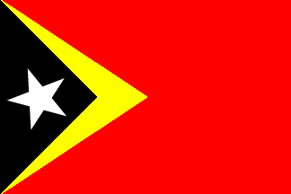
Brand name: Telemor
Logo: 
The brand name “Telemor” is a combination of the word “telecommunications” and “more” – implying a telecom operator that always try to develop and provide Timor Leste people with creative services and the best benefit.
“Telemor” is pronounced similarly to the word “Timor” and “Amor” – which means “love” in local Tetun language. This creates a close relationship between the brand name and Timor Leste country.
Established: 2012
Service launching: 10th July 2013
Servce: Mobile, Internet, fixed broadband
Employees:
Telemor is the biggest mobile operator in Timor-Leste with more than 420,000 subscribers, accounting for approximately 45% market share. It is the only telecom company in Timor-Leste owning a fiber optical network throughout the country covering 96% of population.
Despite of its late joining the market, Telemor has grown dramatically catching up with the number of customers that its competitor had developed in more than 10 monopolized years. This has increasing the mobile penetration of Timor-Leste from 30% to 60% population. The entrance of Telemor has brought up a remarkable change to the telecommunications of Timor-Leste, as The Prime Minister of Timor-Leste Xanana Gusmao said: “Telemor has quickly created remarkable differences and changes”.
With its impressive business performance, Telemor was presented with the “Start-up of the year” category of the International Business Awards 2014 in Paris, France.
In 2014, Telemor reached a high revenue growth rate at 280% (US$25 million) Among other overseas projects of Viettel, this is the first one to make profit after only 6 months running business.

I. MARKET OVERVIEW
1. General information
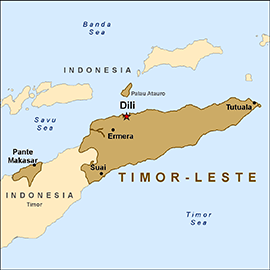
- Country name: Democratic Republic of Timor-Leste
- Area: 14,874 sq. km
- Location: East Timor is an island in the Oceania, which includes the Eastern half of the Timor island, the surrounding islands of the Atauro and Jaco and the Oecussi (Ambeno), 1 part in the NorthWest of the island, in the West Timor of Indonesia.
- Climate: Tropical, hot, humid; distinct rainy and dry seasons:
+ Dry season: From May to December
+ Rainy season: From December to April
- Terrain: Mountainous
- Administrative division: 13 administrative districts; Aileu, Ainaro, Baucau, Bobonaro (Maliana), Cova-Lima (Suai), Dili, Ermera (Gleno), Lautem (Los Palos), Liquica, Manatuto, Manufahi (Same), Oecussi (Ambeno), Viqueque.
- Languages: Tetum (official), Portuguese (official), Indonesian, English. There are about 16 indigenous languages; Tetum, Galole, Mambae, and Kemak are spoken by a significant portion of the population
- Independence: 28/11/1975
- Currency: United States dollar (USD)
2. Economy
- GDP growth rate:
+ GDP growth rate in 2012: 10% (ranked 10th worldwide)
+ GDP per capita in 2012: USD 1,068.00
- GDP composition by sector:
+ Agriculture: 4.3%
+ Industry: 68.3%
+ Service: 27.4% (2012 est.)
- Exports:
+ Export value: USD 34.1 million (2011).
+ Export commodities: oil, coffee, sandalwood, marble.
- Imports:
+ Import value: USD 689 million (2011).
+ Import commodities: food, gasoline, kerosene, machinery
II. SOCIETY
1. Population
- 1,172,390 (July 2012 est.)
- Population growth rate (2013 est.): 2.47%.
- Literacy (age 15 and over can read and write): 58.3%.
- Age ratio:
0-14 years: 42.7% (male 257,340/female 243,174)
15-24 years: 19.7% (male 116,605/female 114,203)
25-54 years: 29.3% (male 166,048/female 177,024)
55-64 years: 4.8% (male 28,717/female 27,011)
65 year and over: 3.6% (male 20,428/female 21,840) (2013 est.)
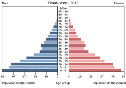
-> East Timor’s population is young: 62.4% of the population is from 0-24 years old.
-> Urban population: 28.3% (2012).
-> Population in Dili capital: 137,879
- Labour force by occupation:
+ Agriculture: 64%
+ Industry: 10%
+ Services: 26%.
2. Ethnic groups
East Timor’s people consists of a number of distinct ethnic groups, most of whom are of mixed Malayo-Polynesian and Melanesian/Papuan descent. The largest Malayo-Polynesian ethnic groups are the Tetum (or Tetun), who lives primarily in the North coast and around Dili; the Mambae in the central mountains; the Tukudede in the area around Maubara and Liquiçá; the Galoli who lives among the Mambae and Makasae tribes; the Kemak in the island of the North-Central Timor and the Baikeno in the area around Pante Macassar.
The main tribes of predominantly Papuan origin include the Bunak in the central interior of Timor island; the Fataluku at the Eastern tip of the island near Lospalos; and the Makasae in the East end of the island.
In addition, like other old colonies of Portugal, as a result of common interracial marriage between races, there is a small population of mixed East Timorese and Portuguese origin, known in Portuguese as mestiços. The most famous mestiços East Timorese is José Ramos-Horta, the once spokeperson of the overseas revolution movement, which is the incumbent President of East Timor. Mário Viegas Carrascalão, the Governor appointed by Indonesia from 1987 until 1992, is also a Mestiços.
There is a small Chinese minority, most of whom are Hakka. Most of them left the country after the invasion of Indonesia.
3. Ethnic characteristics:
- Trust in people
- Expected to self-study, to reach out to the world
- Sensitive, sometimes hot tempered
- Kind hearted, forgiveness
- Proud of local language, independence from Indonesia
- Open to assistance from the outside
- Curious, especially about foreigner
- Eager to self express to others
- Don’t want to be imposed by rules that is inconsistent with their culture and thoughts
- Religious belief: respect for elders, ancestors and the nature.
4. Religion
Roman Catholic 91%, Protestant / Evangelical 3.5%, Muslim 3%.
Roman Catholic was introduced to East Timor by the Portuguese since 1515, however, this belief started to widespread from 1556 at the arrival of the Dominican friar, António Taveira. The East Timorese were not forced to convert however if a local chief converted many of his people would convert as well. The Catholic rites became vernacularized since 1975 when Indonesia occupied the land of East Timor. The Catholic Church became the only protector of people and the rallying point for resistance.
Company Name: VIETTEL BURUNDI S.A
Address: No 51, Boulevard de l'UPRONA, Quartier Rohero II, Rohero Commune, Bujumbura Mairie-
Website: http://www.lumitel.bi/
Brand Name: LUMITEL
Logo:![]()
Lumitel means sunlight, lighting, it expressed vision towards a bright future, prosperous life. Shine is also implied in 3 star on the flag of Burundi.
Burundi is a country with many difficulties, more beautiful future is dream of people here. Therefore, Lumitel wants to become a leading telecommunication company, brings services and better life for Burundi.
Established: 2014
Service launching: 2015
Employees:
Service providing: Mobile, Internet, fixed broadband
Lumitel aims to become the largest telecommunications company in Burundi with 1000 base stations, 5,000km fiber optic network coverage to 95% of the country. Currently the company is in the process of completing the infrastructure to provide the best service to customers under the brand Lumitel

BURUNDI
I. OVERVIEW
1. General Information

- Country: Republic of Burundi
- Area: 27.830 km²
- Capital: Bujumbura
- Location: It is a landlocked country in the African Great Lakes region of Southeast Africa, bordered by Rwanda to the north, Tanzania to the east and south, and the Democratic Republic of the Congo to the west

- Climate:
Peru has a tropical climate. The average temperature is from 22-29 ° C. Average rainfall: 1500 mm. Rainy season from February to May , dry season from June to August.
- Language: Burundi has two official languages: Kirundi and French
- Currency: Franc Burundi (Fbu). Exchange rate: 1 USD = 1.535 BIF
- Independence: 01/7/1962
2. Economy
GDP growth rate:
+ GDP growth rate in 2013: 4.5%
+ GDP per capita in 2013: $ 267
Burundi is one of the five poorest countries in the world. It has one of the lowest per capita GDPs of any nation in the world. The country has suffered from warfare, corruption and poor access to education. According to the Global Hunger Index of 2013, Burundi has an indicator ratio of 38.8, earning the nation the distinction of being the hungriest country in the world in terms of percentage
Approximately 80% of Burundi's population lives in poverty. Famines and food shortages have occurred throughout Burundi, most notably in the 20th century, and according to the World Food Programme. 56.8% of children under age five suffer from chronic malnutrition. One scientific study of 178 nations rated Burundi's population as having the lowest satisfaction with life in the world. As a result of poverty, Burundi is dependent on foreign aid.
Burundi's largest industry is agriculture, which accounted for just over 30% of the GDP. Subsistence agriculture accounts for 90% of agriculture. The nation's largest source of revenue is coffee, which makes up 93% of Burundi's exports. Other agricultural products include cotton, tea, maize, sorghum, sweet potatoes, bananas, manioc (tapioca); beef, milk, and hides. Some of Burundi's natural resources include uranium, nickel, cobalt, copper, and platinum. Besides agriculture, other industries include: assembly of imported components; public works construction; food processing, and light consumer goods such as blankets, shoes, and soap.
- GDP composition by sector:
Agriculture: 44.9%
Industry: 20.9%
Services: 34.1%
- Export:
+ Export: 55.68 million USD (2009)
+Export commodities: coffee, tea, sugar, cotton
Export Markets: Switzerland, EU, Pakistan, Rwanda, Egypt
- Import:
+ Import: 867.2 million USD (2013)
+ Imported commodities: Rice, fabrics, petroleum, foods
Import Markets: Arab Saudi, Kenya, Japan, China, Russia.
II. SOCIETY
1. Population:
Population(2014 est.): 10,395,931 people.
The growth rate of the population (2014 est.): 3.28%.
2. Age:

+ From 0-14 years: 45.6% (male 2,497,999/ female 2,469,564)
+ From 15-24 years: 19.7% (male 1,071,135/ female 1,074,763)
+ From 25-54 years: 28.4% (male 1,533,191/ female 1,559,661)
+ From 55-64 years: 3.8% (male 186,706/ female 225,467)
+ From 65 years and over: 2.5% (108,243 male / female 161,592)
3. Ethnic group:
Hutu (Bantu) 85%, Tutsi (Hamitic) 14%, Twa (Pygmy) 1%, European 3,000, South Asian 2,000
4. Religion:
Sources estimate the Christian population at 80–90%, with Roman Catholics representing the largest group at 60–65%. Protestant and Anglican practitioners constitute the remaining 15–25%. An estimated 5% of the population adheres to traditional indigenous religious beliefs. Muslims constitute 2–5%, the majority of whom are Sunnis and live in urban areas
5. Education:
In 2009, the adult lite literacy rate in Burundi was estimated to be 67% (73% male and 61% female), with a literacy rate of 77% and 76%, respectively, for men and women between the ages of 15 to 24. Literacy among adult women in Burundi has increased by 17% since 2002. Burundi's literacy rate is low due to low school attendance and because literacy in Kirundi only provides access to materials printed in that language. Ten percent of Burundian boys are allowed a secondary education
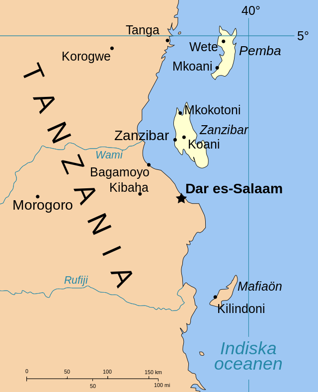
Company name: Viettel Tanzania
Granted mobile license on October 2014, Viettel Tanzania is going to be the first mobile operator using 3g only in Tazania. The company plans to install the biggest telecom network with 10,000 base station and 20,000 km of fiber optical cable, covering 95% nationwide.
I. OVERVIEW
1. General Information

- Country: United Republic of Tanzania
- Capital: Dodoma
- Area: 954 090 km² (Grade 30)
- Geographical location:
Tanzania is a country in East Africa within the African Great Lakes region. It is bordered by Kenya and Uganda to the north; Rwanda, Burundi, and the Democratic Republic of the Congo to the west; Zambia, Malawi, and Mozambique to the south; and the Indian Ocean to the east. Kilimanjaro, Africa's highest mountain, is in northeastern Tanzania.
- Climate:
Climate varies greatly within Tanzania. In the highlands, temperatures range between 10 and 20 °C (50 and 68 °F) during cold and hot seasons respectively. The rest of the country has temperatures rarely falling lower than 20 °C (68 °F). The hottest period extends between November and February (25–31 °C or 77.0–87.8 °F) while the coldest period occurs between May and August (15–20 °C or 59–68 °F). Annual temperature is 20 °C (68.0 °F). The climate is cool in high mountainous regions.
Tanzania has two major rainfall regimes: one is uni-modal (October–April) and the other is bi-modal (October–December and March–May). The former is experienced in southern, central, and western parts of the country, and the latter is found in the north from Lake Victoria extending east to the coast. The bi-modal regime is caused by the seasonal migration of the Intertropical Convergence Zone.
- Administrative division
Tanzania is divided into thirty regions (mkoa), twenty-five on the mainland and five in Zanzibar (three on Unguja, two on Pemba). 169 districts (wilaya), also known as local government authorities, have been created. Of the 169 districts, 34 are urban units, which are further classified as three city councils (Arusha, Mbeya, and Mwanza), nineteen municipal councils, and twelve town councils.
- Language: Kiswahili or Swahili, Kiunguju, Arabic and English
- Currency: Tanzanian Shilling (TZS). Exchange rate: USD 1.00 TZS = 0.000550700
- Independence: 26/4/1964
2. Economy
- GDP growth rate:
+ GDP in 2014: 36.6 million
+ GDP per capita in 2013: 695 USD
+ GDP growth rate: 7.2% (2013 est)
Tanzania weathered the Great Recession, which began in late 2008 or early 2009, relatively well. Strong gold prices, bolstering the country's mining industry, and Tanzania's poor integration into global markets helped to insulate the country from the downturn. Since the recession ended, the Tanzanian economy has expanded rapidly thanks to strong tourism, telecommunications, and banking sectors
According to the United Nations Development Program, however, recent growth in the national economy has benefited only the "very few", leaving out the majority of the population. Tanzania's 2013 Global Hunger Index was worse than any other country in the EAC except Burundi. The proportion of persons who were undernourished in 2010–12 was also worse than any other EAC country except Burundi
- GDP composition by sector
+ Agriculture: 24.5%
+ Industry: 22.2%
+ Services: 44.3% (2014)
- Export
+ Exports value: 2.98 billion (2009)
+ Exports commodities: coffee, cotton, sisal, cashew nuts, minerals and tobacco.
( China, India, the Netherlands, Germany, ....)
- Import
+ Import value: 5.78 billion (2009)
+ Imported commodities: manufactured goods (machinery, consumer goods, vehicles), chemicals, pharmaceuticals, industrial raw materials, crude oil ...
( South Africa, China, India, UAE ...)
In recent years, Tanzania is donated by IMF, World Bank to improve infrastructure in this country. The changes in banking system recently helped Tanzania to attract investment.
II. Social
- Population: 47,601,796 people (2014 est)
- Demographic: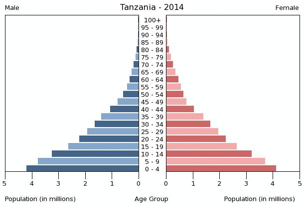
0-14 years: 44.8%
15-24 years: 19.4%
25-54 years: 29.38%
55-64 years: 3.5%
Over 65 years: 2.9%
- Population growth rate (%): 2,820
2.Ethnicity group:
Christian 30%, US 35%, indigenous 35%
3. Religion:
62% of Tanzania's population is Christian, 35% Muslim, and 3% are members of other religious groups
The Christian population is mostly composed of Roman Catholics. Among Protestants, the large number of Lutherans, Seventh-Day Adventist Church and Pentecostal Churches and Moravians
Zanzibar is about 97 percent Muslim. On the mainland, Muslim communities are concentrated in coastal areas, with some large Muslim majorities also in inland urban areas especially and along the former caravan routes. Hinduism is a minority religion in Tanzania, with 30,000 adherents (1996). Most of them are descendants of India (Gujarat). There are several Hindu temples in Dar es Salaam, most of which are located in the city center.
4. Education
The literacy rate Tanzania is estimated to be 73%. Education is compulsory for seven years, until age 15, but most children do not attend school, and some do not attend any public religious hierarchy.
Brand name: Mytel
Address: 61-63, Zoological Garden Rd, Dagon Township, Yangon, Myanmar
Website: mytel.com.mm
Contact email: mytel@mytel.com.mm
The brand name “Mytel” is the combination of "My" in "Myanmar" and "Tel" in "Telecom". Mytel means a telecom network for Myanmar people.
Mytel can also be perceived as My Telecom Network that is customer-centric and offers personalized services to every single user.
The operator is a joint venture between Vietnam’s Viettel, which is contributing 49 per cent of the network investment, and a consortium of local companies operating under the name Telecom Internation Myanmar Co.,Ltd
MyTel plans to invest nearly $1.5 billion to deploy 7,200 base stations to build out a 4G-only network. The Viettel’s telecom operator in Myanmar set the target of reaching 90 per cent of the country’s population with 4G coverage when it officially launches in Q1 2018.
Myanmar officially the Republic of the Union of Myanmar and also known as Burma, is a sovereign state in Southeast Asia. Myanmar is bordered by India and Bangladesh to its west, Thailand and Laos to its east and China to its north and northeast. To its south, about one third of Myanmar's total perimeter of 5,876 km (3,651 mi) forms an uninterrupted coastline of 1,930 km (1,200 mi) along the Bay of Bengal and the Andaman Sea. The country's 2014 census counted the population to be 51 million people. Myanmar is 676,578 square kilometers (261,228 square miles) in size.
Its capital city is Naypyidaw, and its largest city and former capital is Yangon (Rangoon). Myanmar has been a member of the Association of Southeast Asian Nations(ASEAN) since 1997.
Myanmar is a country rich in jade and gems, oil, natural gas and other mineral resources. In 2013, its GDP (nominal) stood at US$56.7 billion and its GDP (PPP) at US$221.5 billion
Geography
Myanmar has a total area of 678,500 square kilometres (262,000 sq mi). It lies between latitudes 9° and 29°N, and longitudes 92° and 102°E. As of February 2011, Myanmar consisted of 14 states and regions, 67 districts, 330 townships, 64 sub-townships, 377 towns, 2,914 Wards, 14,220 village tracts and 68,290 villages.
Administrative divisions
Myanmar is divided into seven states and seven regions, formerly called divisions. Regions are predominantly Bamar (that is, mainly inhabited by the dominant ethnic group). States, in essence, are regions that are home to particular ethnic minorities. The administrative divisions are further subdivided into districts, which are further subdivided into townships, wards, and villages.
Ethnic Groups
Myanmar is ethnically diverse. The government recognises 135 distinct ethnic groups. There are at least 108 different ethnolinguistic groups in Myanmar, consisting mainly of distinct Tibeto-Burman peoples, but with sizeable populations of Tai–Kadai, Hmong–Mien, and Austroasiatic (Mon–Khmer) peoples
Religion
Many religions are practised in Myanmar. Religious edifices and orders have been in existence for many years. Festivals can be held on a grand scale. The Christian and Muslim populations do, however, face religious persecution and it is hard, if not impossible, for non-Buddhists to join the army or get government jobs, the main route to success in the country. Such persecution and targeting of civilians is particularly notable in Eastern Myanmar, where over 3000 villages have been destroyed in the past ten years. More than 200,000 Muslims have fled to Bangladesh over the last 20 years to escape persecution
Languages
Myanmar is home to four major language families: Sino-Tibetan, Tai–Kadai, Austro-Asiatic, and Indo-European. Sino-Tibetan languages are most widely spoken. The primary Tai–Kadai language is Shan. Mon, Palaung, and Wa are the major Austroasiatic languages spoken in Myanmar. The two major Indo-European languages are Pali, the liturgical language of Theravada Buddhism, and English.